|
|
The Film . | Contact . | Downloads . | Making Of . | Share The Story | ||
| Bram Sels, 8 June 2011 | ||||

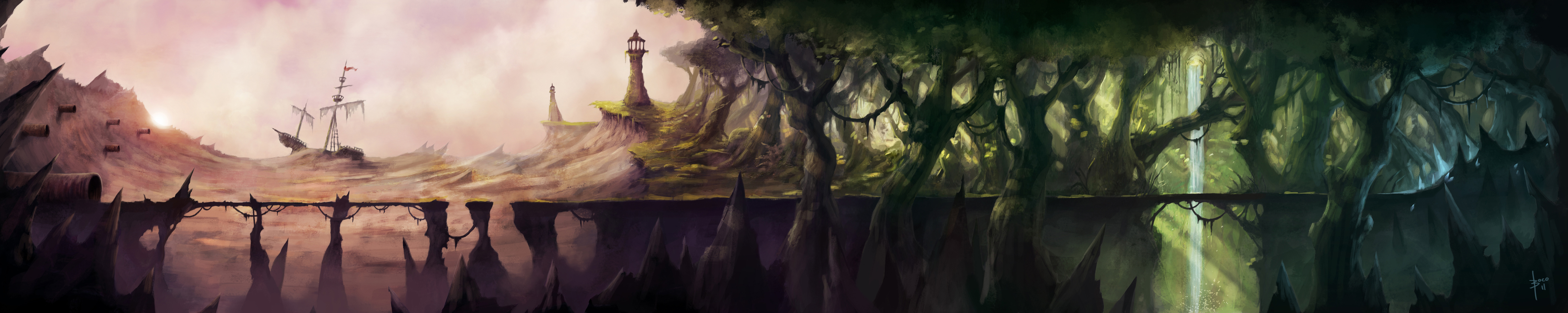
The Well Of A Thousand Words is an animated short about a society that thrives and survives on telling stories that come from a well in their town. It tells the tale of a young boy who feels he doesn't belong in that society, who doesn't believe in the power of stories and who in a fit of rage makes the well stop producing stories. As a result, the elder of the town gets sick and the boy sets out on a journey to restore the source of the stories and save the elder and the town. Because of the story-based theme of the script, we had to work as varied and colorful as possible. In the three months we had before the deadline we wanted to develop as many locations, scenes, colors and moods as we could imagine. Eventually that idea was boiled down to 6 different sets that would then be divided into different scenes with different light, color, weather, etc. 
As said, we boiled down the script to 6 different sets: a town, a wasteland/forest, a cave-system that connected the two, a crystal cave, an airship and the interior of that airship. Those sets would then be used in different settings so that the viewer wouldn't have the feeling of looking at the same illustrations over and over again. For the village for instance, we needed an evening but also a night setting, while for the airship we needed a version in blue sky, one in gray, one in pink, one at night, one in a storm (see below) and a long shot of each. Eventually only the pink, night and storm versions were used. As an illustrator the biggest difference in working on this project was of course that the illustrations would not be still but would be used for multi-plane (parallax) scrolling. In other words, the illustrations would have to be divided into different layers that could move over each other, which brings a lot of problems with it. One of the biggest issues I encountered was the fact that I would have to think about every brushstroke I made. Did I make it on the right layer? Was it opaque enough so that the background wouldn't be visible when the layer moved? Did I clean the 'bad' strokes up enough? (see below) 
It might seem like something unimportant and trivial, but when the layers start moving those 'invisible' strokes suddenly become very apparent. Because of that I needed to rework every set in the end to get these errors out. Another problem with multi-plane scrolling is that it's more difficult to change the entire scene in one click. Let's say the overall color-tone would be too red. In Photoshop fixing such a problem seems rather easy, but when the end result needs to be six layers you can't just add an adjustment layer and work over it. You need to adjust the color of every layer on its own (or create one adjustment layer and duplicate and merge it on the other layers). |
Another problem I encountered was that I also needed to draw the parts that I normally wouldn't, because they were covered by foreground elements. When the planes start moving, those parts of the background suddenly become visible, and thus need to be drawn out. This makes it very difficult to work on one composition or to change it if needed. In terms of layers the Village for instance consists of a fully drawn out background group (with three cloud-layers that can hover over each other, a moon-layer that has to stay in place and an overlay to transfer the moonlight onto the clouds), a building group (with two building-layers and an overlay for the lights in those buildings), a platform group (with a platform-layer for the actors to walk on and another overlay for the campfire and the torches near the well), and a foreground group with more houses. 
|
|||
 (High-res: Download)
(Click on the arrows below to scroll through the steps) (High-res: Download)
(Click on the arrows below to scroll through the steps) |
||||
|
Over the last three years I've been through an enormous evolution in the way I work. When I started working digitally I always started out in color like I would when painting with paint. The only difference when working with paint however is that paint in a way makes your life easy because you can limit yourself to only a few tubes of paint. In other words, you create an entire gamma of colors ranging from very bright colors to intense dark colors, from let's say 5 or 6 tubes, but when working digitally, you suddenly have all the paint you can imagine spread out in front of you. That might seem like a benefit, but in fact it makes working in values much harder. Therefore a lot of digital artists start working in black & white, because without color you only have to think about values, composition, anatomy, etc. When those things are in order, it's really easy to add color. That's not to say you absolutely have to start in black & white, but understanding the basics of value and how they translate digitally, is absolutely mandatory. The Histogram  In this case however, starting out in black & white wouldn't pay off, because I absolutely needed to keep the layers separate. Adding color to black & white
layers would not be impossible, but would be a lot more difficult than just starting out in color. I did however use a black layer on top of the others, changed the blending
mode to 'color' and switched it on and off every now and then to check the values.
In this case however, starting out in black & white wouldn't pay off, because I absolutely needed to keep the layers separate. Adding color to black & white
layers would not be impossible, but would be a lot more difficult than just starting out in color. I did however use a black layer on top of the others, changed the blending
mode to 'color' and switched it on and off every now and then to check the values.
Another neat trick is to have your histogram open at all time. It lets you check how many of each value you have in your painting. The Histogram above is the one for Wasteland for instance. The idea is to have a good flow in your values, that makes your paintings more 'readable' and smooth. You'll notice that when you change brightness, contrast or levels, the flow of your histogram gets 'cut up', which means you lost some value. Sometimes that's unavoidable, but being aware of the problem makes you able to counter it by painting the 'lost' values back in yourself. Another benefit of the histogram is that you can see how much pure black (left) or pure white (right) you have in your painting. Knowing pure black and pure white do not exist in the real world means it's probably not a good idea to use them in a painting that refers to that world. In other words, your histogram let's you know if you 'crushed' your darker parts into pure (lifeless) black, or did the opposite to your brighter parts. |
Painting The briefing for Wasteland consisted of a few elements that we couldn't do without. There needed to be some sort of pipe-system on the left, a dried up sea, a forest, and an entrance to a Crystal Cave on the right. Apart from that I was given absolute freedom to paint whatever I wanted. I started out working on composition, values and color transition. I used a combination of my own brushes and the brush-set Daarken has provided on his website. Those of you who don't know him definitely need to check out his work, he's a great guy and an awesome illustrator (link). You can still download his brush-set under tutorials. When I felt the composition was up to a point I was satisfied with it, I mailed it over to the director and got green to proceed. I did need to change the color scheme to a more varied one though, and the ship in the back needed to be smaller. Truth be told, on Wasteland the lay-out was spot on fairly quick, but on other scenes like the Airship it took a lot more trial and error to get it right. After finishing the lay-out and working a bit more on the color-scheme, the hard part done. The detailing went without trouble and in the end the cleaning up went fast too. I did however need to redo the entire background of clouds because they seemed too static when animated and the sun turned out to be merged in the wrong layer. 
|
|||
 |
||||
 The last problem we faced were the textures in the characters. Since the animations would be provided by real life actors, in front of a bluescreen, it wouldn't be easy to make them fit into a painted scene. If the actors would be filtered out and their silhouettes would be filled with a solid black layer, they would stand out and it would feel like they were simply pasted upon their surroundings in stead of actually living in them. That's why we needed to come up with a solution, which came in the form of coloured textures. To fit in more with the story those textures would be filled with words, so that the characters would be made up of text. To make the transition to the scene better, those textures would also be colored according to the surroundings they were going to be used in. The texture-layer above is the one used in the Crystal Cave. From left to right you can see a transition from green to blue, and from blue to red, according to location the actors would be in the scene. To avoid blending in with the scene to much, every character got a inner shadow which made them not only pop out more, but gave them some dept as well. |
 Bram Sels was born in Belgium in 1986 and has master degrees in both Visual Arts and Art History Teaching. While today hes mostly a digital illustrator, he has a background of graphic design and advertising. Currently he works as a freelance illustrator under the pseudonym 'Boco', and is looking for freelance inquiries as we speak.  Web: www.thewellofathousandwords.com Web: www.artofboco.com Mail: boco@artofboco.com |
|||
© 2011 All rights reserved. All images and content are the property of their respective owners and makers and may not be used without written consent.